Customize components
Further customize the week-view by providing your own components.
Event content
First you should check if the props eventContainerStyle and eventTextStyle are enough for your use case.
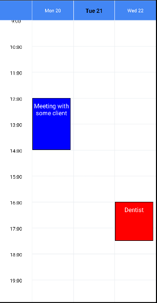
Provide your custom component with the EventComponent prop for regular events, and the AllDayEventComponent prop for all-day events. The component will be rendered inside a TouchableOpacity with background color set to event.color and placed with absolute position in the grid. The component receives the event as prop.
For example, to display events with a title and description:
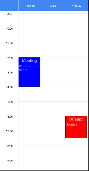
const myEvents = [
  {
    id: 1,
    startDate: new Date(2023, 1, 20, 12),
    endDate: new Date(2023, 1, 20, 14),
    color: 'blue',
    title: 'Meeting',
    description: 'with some client',
  },
  {
    id: 2,
    startDate: new Date(2023, 1, 22, 16),
    endDate: new Date(2023, 1, 22, 17, 30),
    color: 'red',
    title: 'Dr appt',
    description: 'Dentist',
  },
];

const MyEventComponent = ({ event }) => (
  <>
    <Text style={{fontSize: 18, fontWeight: 'bold'}}>{event.title}</Text>
    <Text style={{fontSize: 16, alignSelf: 'flex-start'}}>
      {event.description}
    </Text>
  </>
);

<WeekView
  events={myEvents}
  EventComponent={MyEventComponent}
/>
Header days
First you should check if the props headerStyle, headerTextStyle and formatDateHeader are enough for your use case.
Use these props to provide your own components and fully customize the days in the header:
TodayHeaderComponent: to highlight today by rendering it differently from the other days.DayHeaderComponent: to render every day in the header. OverridesTodayHeaderComponent.
Both components receive these props:
date(moment Date) - moment date object containing today's date.formattedDate(string) - day formatted according toformatDateHeader, e.g."Mon 3".textStyle(object) - text style used for every day.isToday(bool) - indicate if thedateis today or not.
Examples:
const MyTodayComponent = ({formattedDate, textStyle}) => (
  <Text style={[textStyle, {color: 'black', fontWeight: 'bold'}]}>
    {formattedDate}
  </Text>
);

<WeekView
  TodayHeaderComponent={MyTodayComponent}
/>
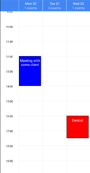
const MyDayComponent = ({date, formattedDate, textStyle}) => {
  const nEventsInDay = myEvents.filter(evt =>
    moment(evt.startDate).isSame(date, 'day'),
  ).length;
  return (
    <>
      <Text style={textStyle}>{formattedDate}</Text>
      <Text>{nEventsInDay} events</Text>
    </>
  );
};

<WeekView
  DayHeaderComponent={MyDayComponent}
/>
Refreshing
Setting isRefreshing={true} displays an activity indicator in the view. You can customize the displayed component by providing your own RefreshComponent.
Example:
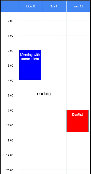
const MyRefreshComponent = ({style}) => (
  <Text style={[
    style, // you must pass down the style to set the position properly
    {fontSize: 20, color: 'black'}
  ]}>
    Loading...
  </Text>
);

<WeekView
  isRefreshing={true}
  RefreshComponent={MyRefreshComponent}
/>